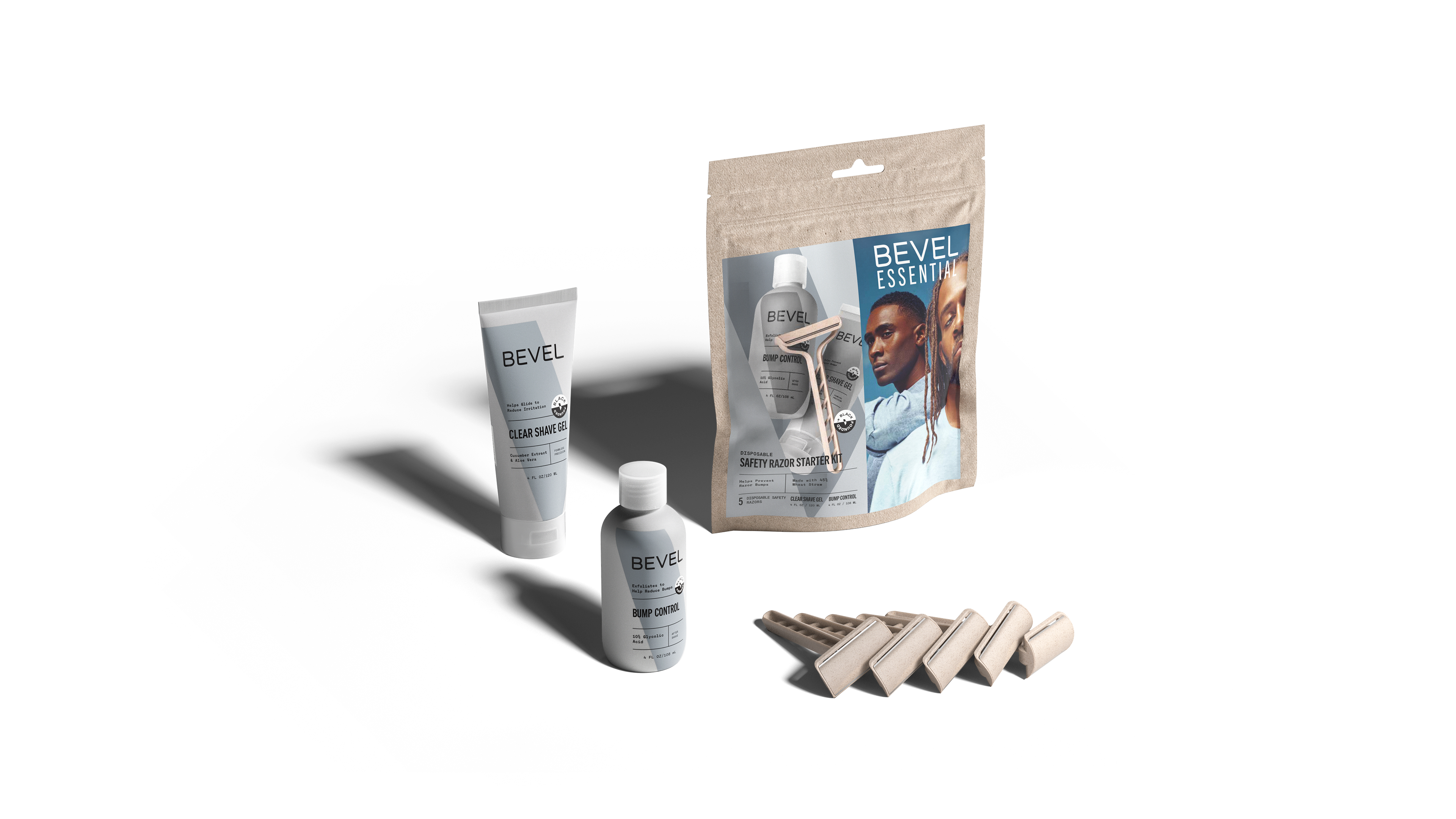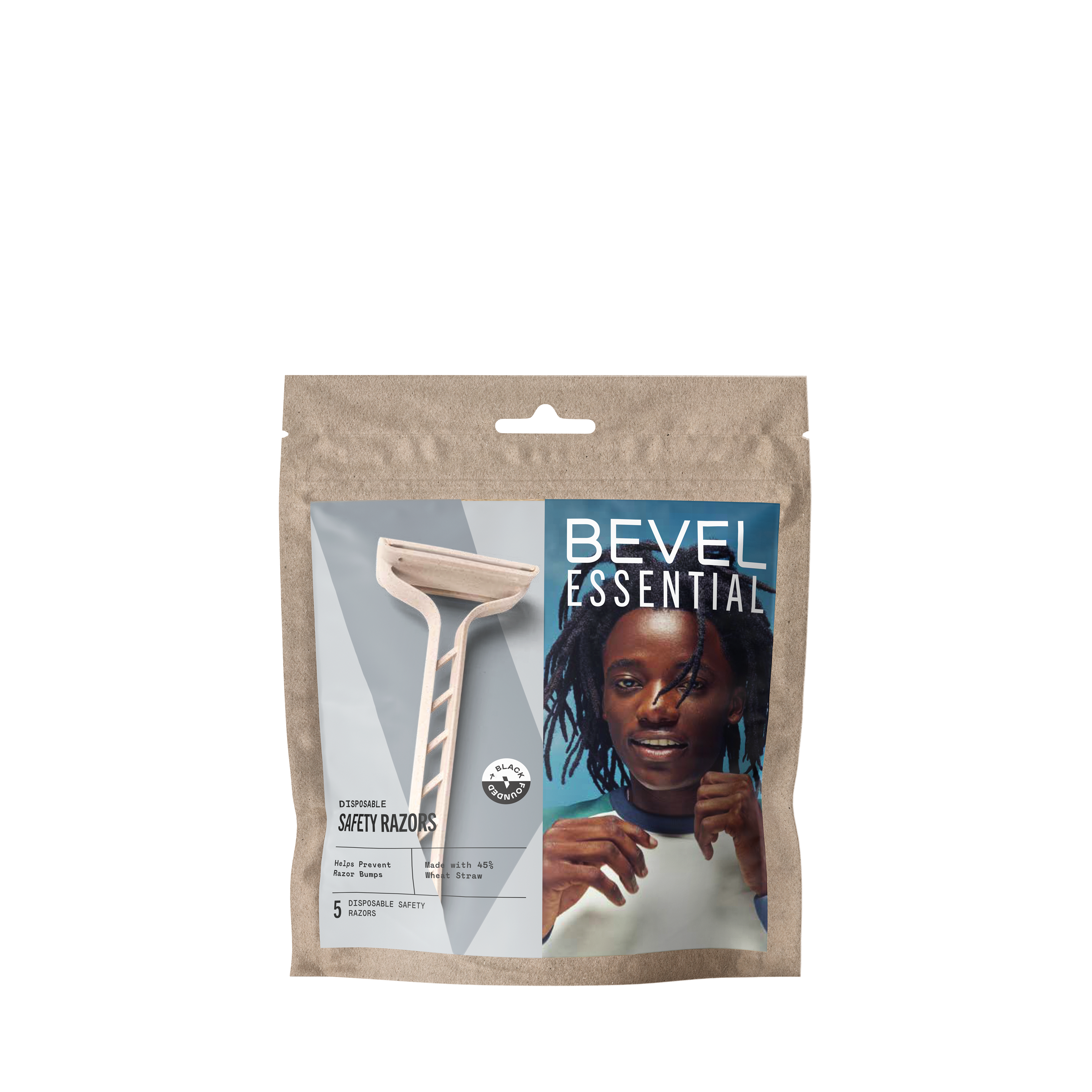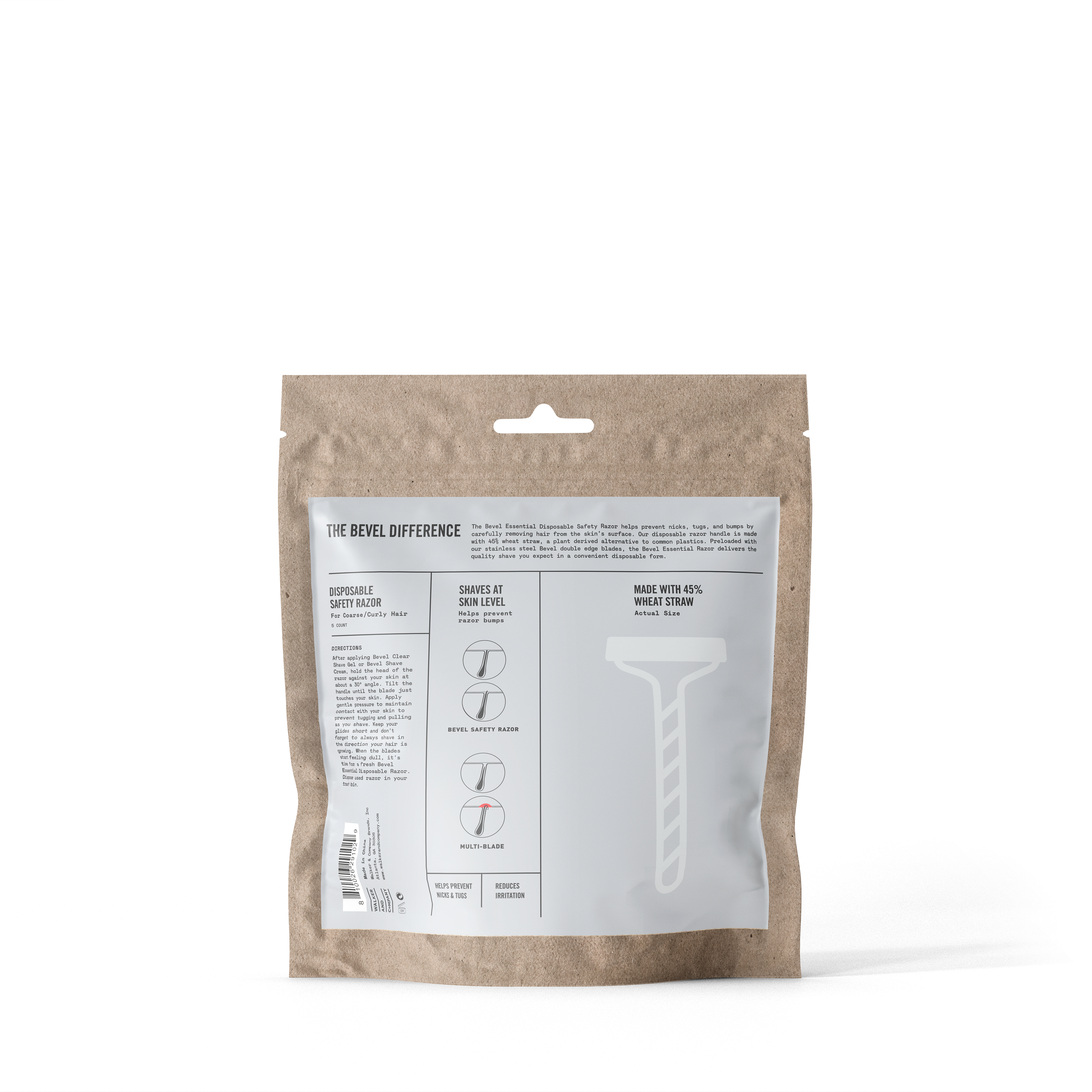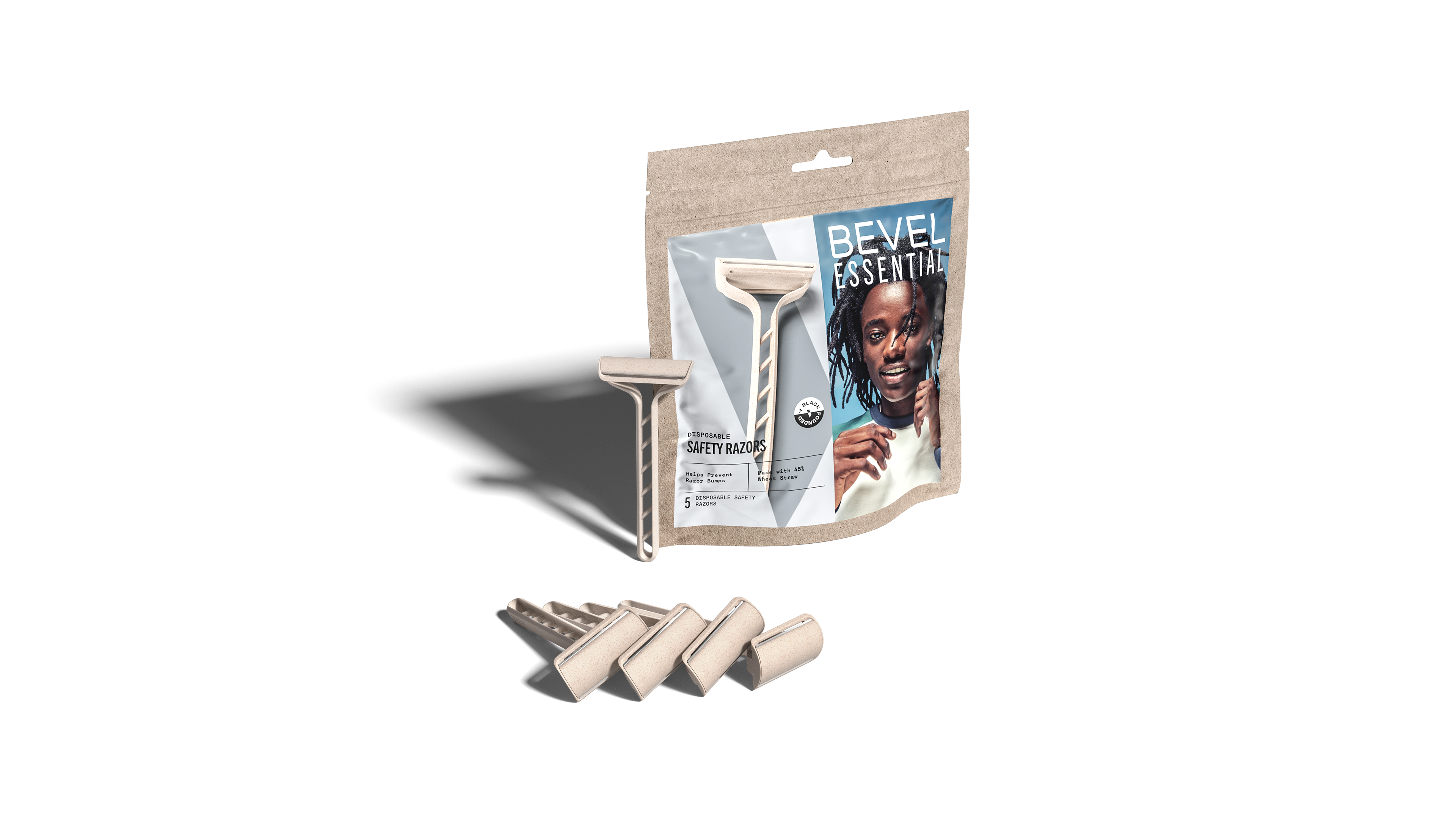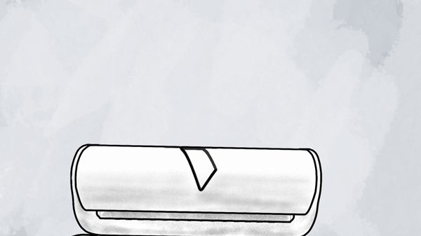
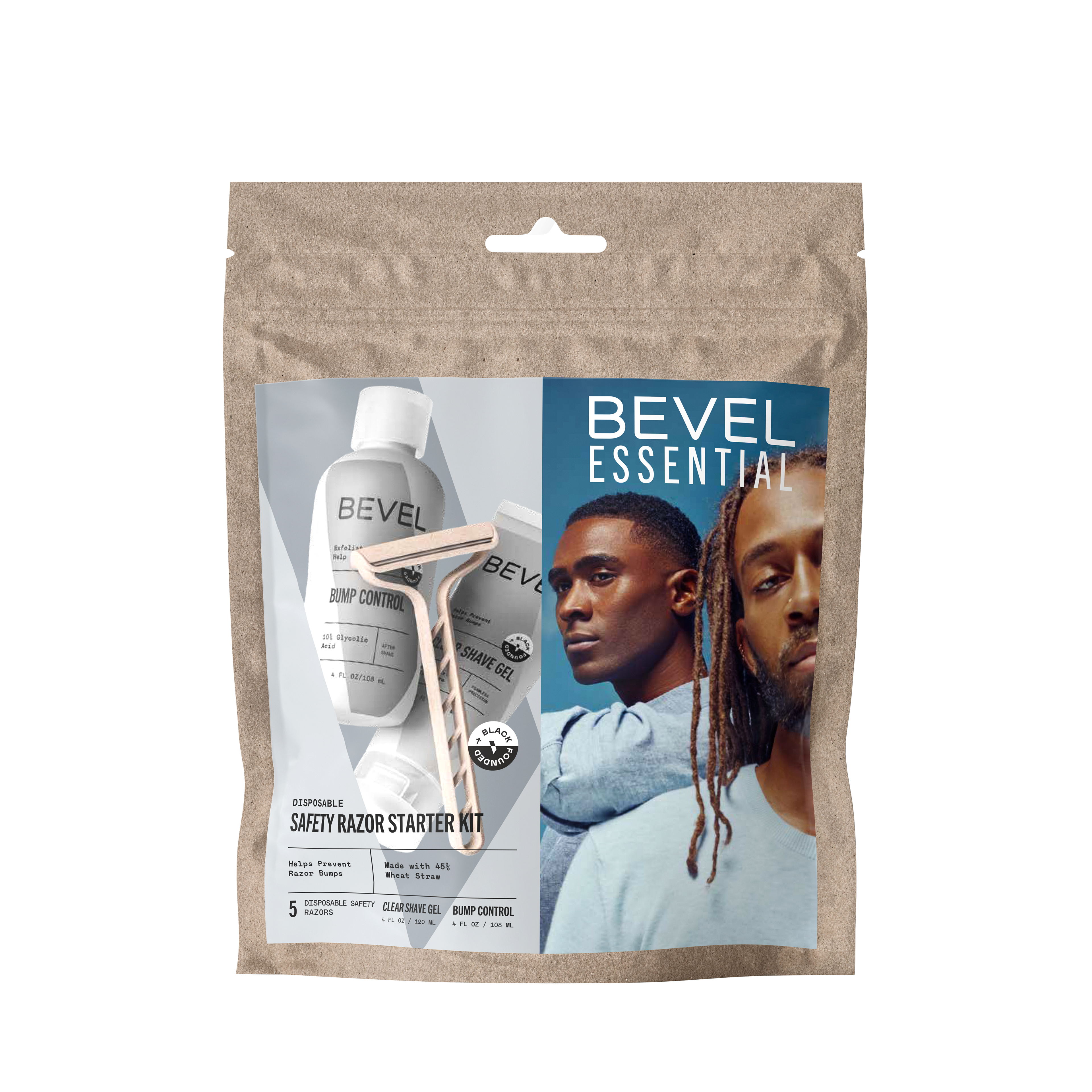
Marketing directive focussed on the black Gen Z creative community, to communicate that the packaging and razor are disposable yet (somewhat) compostable.
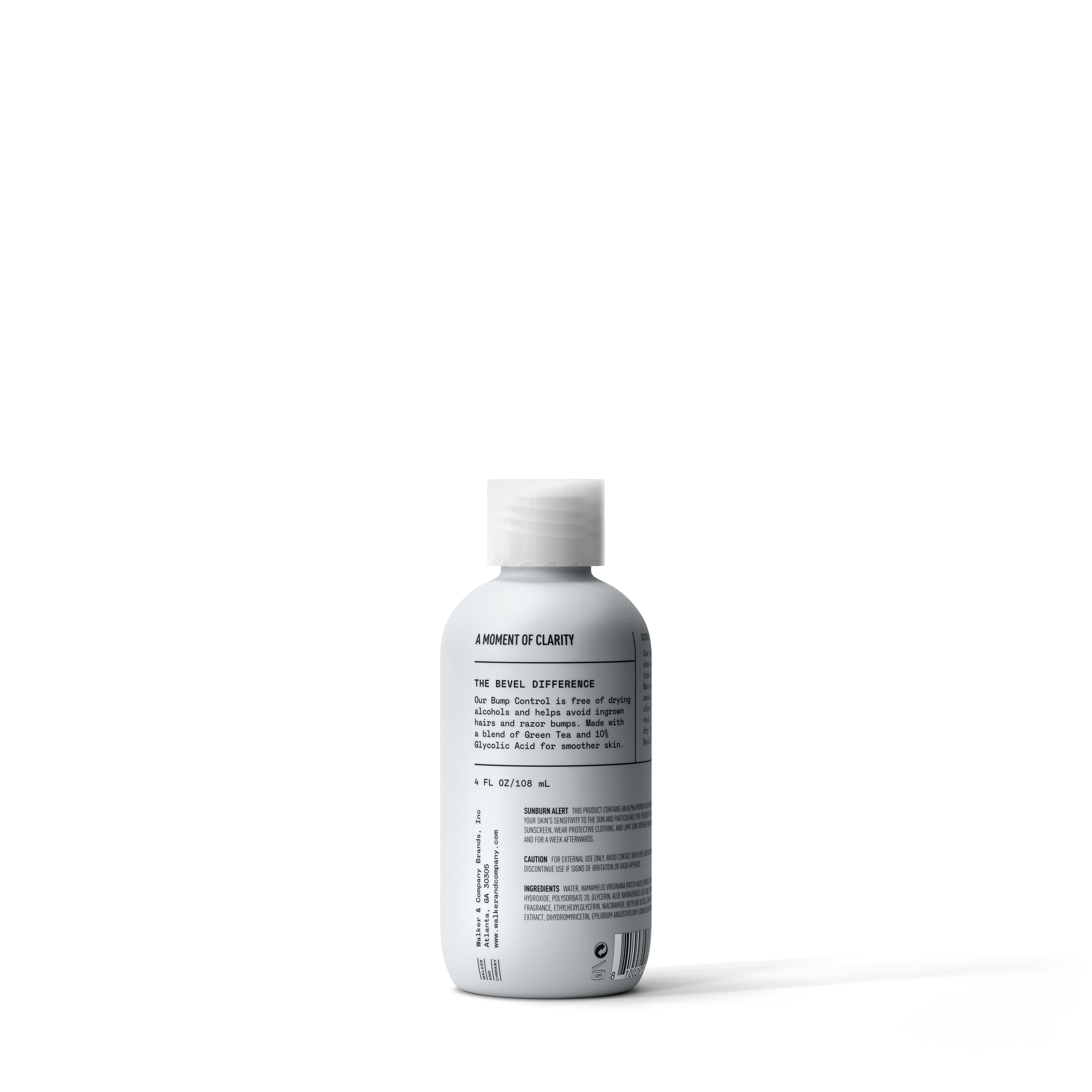
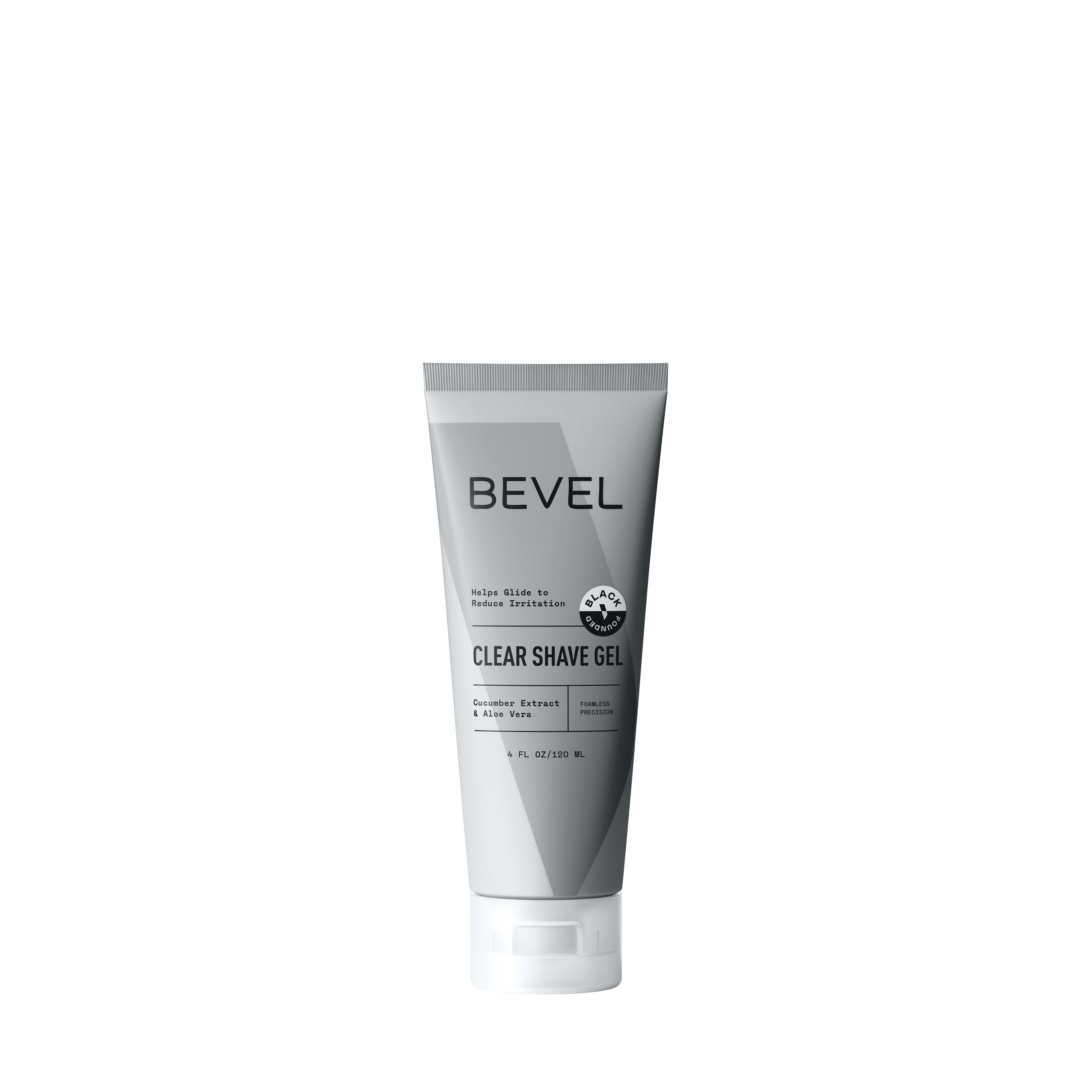
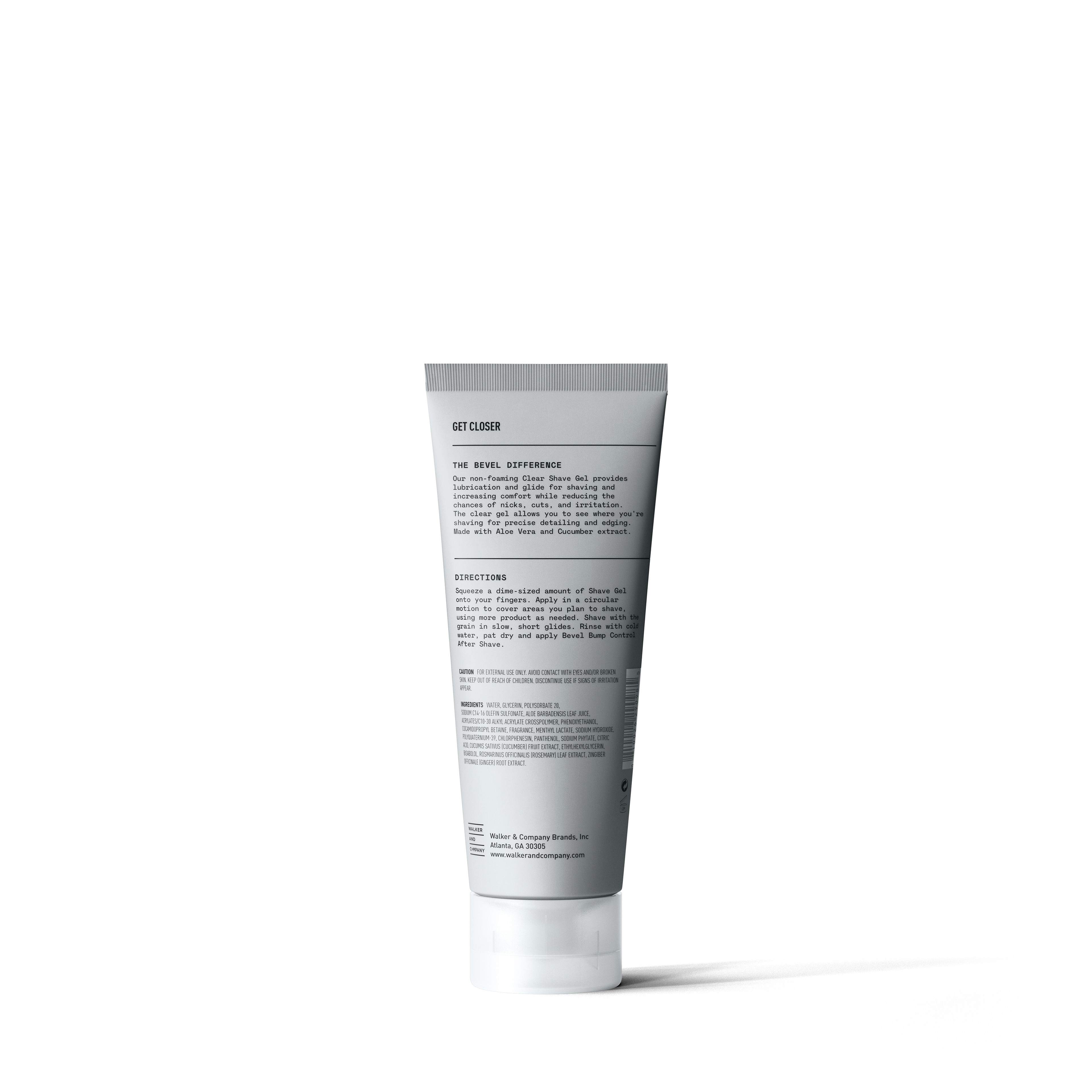
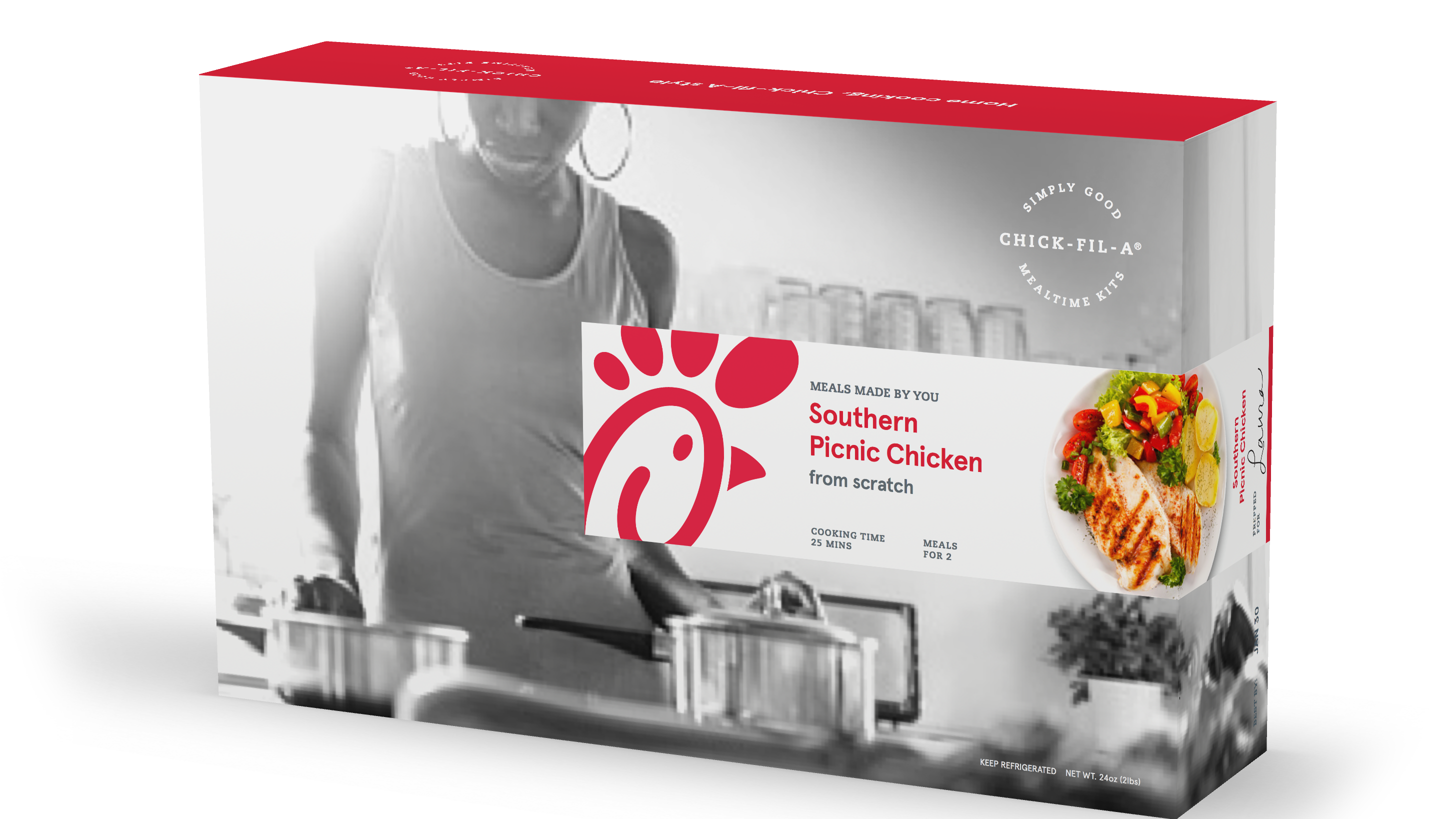
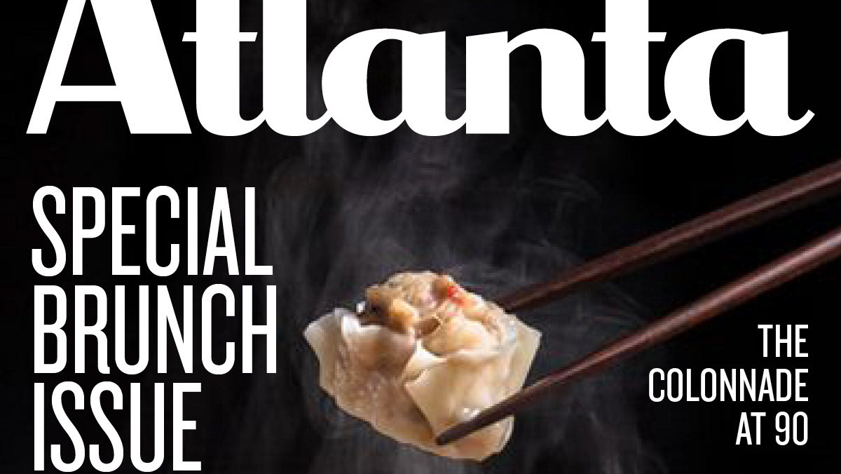
For bottle and tube packaging typography, I connected with Atlanta agency Metaleap Creative to define the typographic grid on the bottle, an amped up redesign from the classic understated type of Bevel's legacy packaging. the team was inspired by '60s civil rights posters, and i updated the color scheme to be brighter, younger and inspired by minimalist streetwear. lifestyle Photography by Atlanta-based power duo ABDM Studios, product renders by justin goode.